
Getting Started with - Tailwind CSS
Rapidly build modern websites without ever leaving your HTML.


What is Tailwind CSS
Tailwind CSS is a utility-first CSS framework designed to enable users to create applications faster and easier. Anyone can use utility classes to control the layout, colour, spacing, typography, shadows, and more to create a completely custom component design — without leaving your HTML or writing a single line of custom CSS.
Why Tailwind CSS
A lot is going on in web development. As a result, it can sometimes become an overly complicated task. Mapping the impact of styling may become tedious and time-consuming, impeding the application/progress.
All of the issues mentioned above will be resolved by using Tailwind CSS.
Advantages of Tailwind CSS
It is Highly Customizable
It Has Common Utility Patterns
It Can Be Optimized Using PurgeCSS
It Enables Building Complex Responsive Layouts Freely
It Facilitates Fluid Community Interaction
📍Installation Of Tailwind CSS
There are a lot of ways of installation of Tailwind CSS but the easiest way to get started with it is through Content Delivery Network(i.e. CDN)
- Add the CDN script to your HTML Add the CDN script tag to the of your HTML file, and start using Tailwind’s utility classes to style your content.
<script src="https://cdn.tailwindcss.com"></script>
Example
<!doctype html>
<html>
<head>
  <meta charset="UTF-8">
  <meta name="viewport" content="width=device-width, initial-scale=1.0">
  <script src="https://cdn.tailwindcss.com"></script>
</head>
<body>
  <h1 class="text-3xl font-bold underline">
    Hello world!
  </h1>
</body>
</html>
Core Concepts
Utility First Fundamental
Responsive Design
Reusing Styles
Handling Hover, Focus, and Other States
Dark Mode
Customizing the Framework
Outcome
It reduces the code lines
Made easy to debug the code
Need not think about the naming of a class
This method is done without writing a single line of CSS
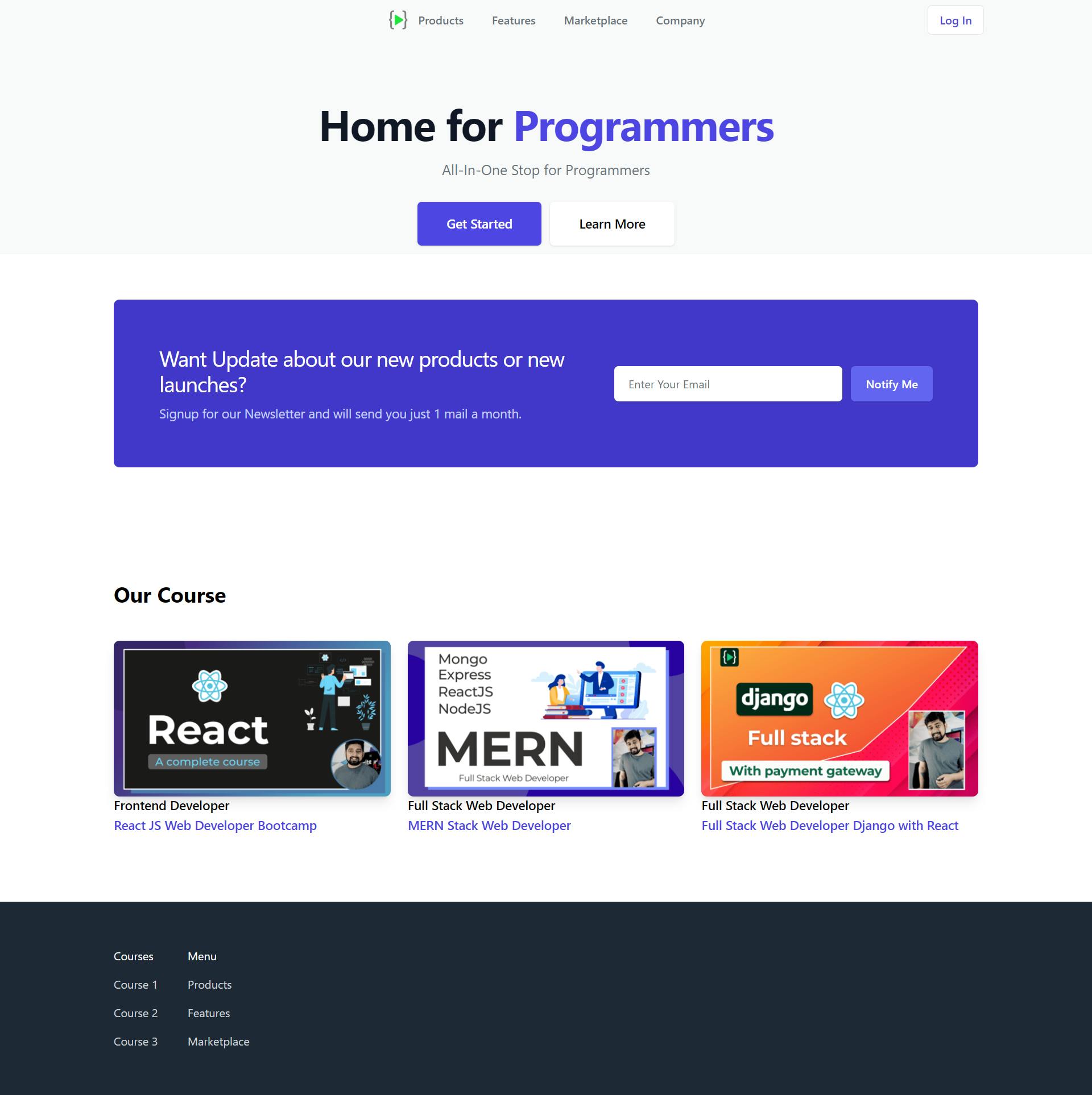
Website Made Using Tailwind CSS
HTML
<!DOCTYPE html>
<html lang="en">
  <head>
    <meta charset="UTF-8" />
    <meta http-equiv="X-UA-Compatible" content="IE=edge" />
    <meta name="viewport" content="width=device-width, initial-scale=1.0" />
    <link
      rel="stylesheet"
      href="https://cdnjs.cloudflare.com/ajax/libs/font-awesome/4.7.0/css/font-awesome.min.css"
    />
    <script src="https://cdn.tailwindcss.com"></script>
    <title>Tailwind CSS Project</title>
  </head>
  <body>
    <!-- Hero Section -->
    <div class="relative bg-gray-50 overflow-hidden">
      <div>
        <div class="max-w-7xl mx-auto sm:px-6 mt-2">
          <nav
            class="relative flex items-center justify-between sm:h-10 md:justify-center"
          >
            <div class="flex items-center justify-between w-full md:w-auto">
              <a href="#">
                <img
                  class="h-8 w-auto mr-3"
                  src="https://asset-cdn.learnyst.com/assets/schools/2410/resources/images/logo_lco_4dsl6o.png"
                  alt=""
                />
              </a>
              <div class="mr-2 flex items-center md:hidden">
                <button
                  class="bg-gray-50 rounded-md p-2 inline-flex item-center justify-center hover:bg-gray-100 focus:outline-none focus:ring-2"
                >
                  <span class="sr-only">Open Main Menu</span>
                  <span class="text-2xl"
                    ><i class="fa fa-bars" aria-hidden="true"></i
                  ></span>
                </button>
              </div>
            </div>

            <div class="hidden md:flex md:space-x-10">
              <a
                href="#"
                class="font-medium text-gray-500 hover:text-gray-900 hover:underline"
                >Products</a
              >
              <a
                href="#"
                class="font-medium text-gray-500 hover:text-gray-900 hover:underline"
                >Features</a
              >
              <a
                href="#"
                class="font-medium text-gray-500 hover:text-gray-900 hover:underline"
                >Marketplace</a
              >
              <a
                href="#"
                class="font-medium text-gray-500 hover:text-gray-900 hover:underline"
                >Company</a
              >
            </div>
            <div
              class="hidden md:absolute md:flex md:items-center md:justify-end md:inset-y-0 md:right-0"
            >
              <a
                class="inline-flex items-center px-4 py-2 border font-medium rounded-md text-indigo-600 bg-white hover:bg-gray-50"
                href=""
                >Log In</a
              >
            </div>
          </nav>
        </div>
      </div>

      <!--text area-->
      <main class="mt-16 mx-auto max-w-7xl px-4 sm:mt-24">
        <div class="text-center">
          <h1
            class="text-4xl tracking-tight font-bold text-gray-900 sm:text-5xl sm:tracking-tight md:text-6xl md:tracking-tight"
          >
            <span class="block xl:inline">Home for</span>
            <span class="block text-indigo-600 xl:inline">Programmers</span>
          </h1>
          <p
            class="mt-3 mx-w-md mx-auto text-base text-gray-500 sm:text-lg md:mt-5 md:text-xl"
          >
            All-In-One Stop for Programmers
          </p>
          <div
            class="mt-5 max-w-md mx-auto sm:flex sm:justify-center md:mt-8 sm:mb-3"
          >
            <div class="rounded-md shadow">
              <a
                class="w-full flex items-center justify-center px-8 py-3 border border-transparent text-base font-medium rounded-md text-white bg-indigo-600 hover:bg-indigo-700 md:py-4 md:text-lg md:px-10"
                href="#"
                >Get Started</a
              >
            </div>
            <div class="mt-3 rounded-md shadow sm:mt-0 sm:ml-3">
              <a
                class="w-full flex items-center justify-center px-8 py-3 border border-transparent text-base font-medium rounded-md text-indigo bg-white hover:bg-indigo-500 md:py-4 md:text-lg md:px-10"
                href="#"
                >Learn More</a
              >
            </div>
          </div>
        </div>
      </main>
    </div>

    <!--Newsletter Section-->
    <div class="bg-white">
      <div class="max-w-7xl mx-auto px-4 py-12 sm:px-6 lg:py-16 lg:px-8">
        <div
          class="px-6 py-6 bg-indigo-700 rounded-lg md:py-12 md:px-12 lg:py-16 lg:px-16 xl:flex xl:items-center"
        >
          <div class="xl:w-0 xl:flex-1">
            <h2
              class="text-2xl font-body tracking-tight text-white sm:text-3xl sm:tracking-tight"
            >
              Want Update about our new products or new launches?
            </h2>
            <p class="mt-3 max-w-3xl text-lg leading-6 text-indigo-200">
              Signup for our Newsletter and will send you just 1 mail a month.
            </p>
          </div>
          <div class="mt-8 sm:w-full sm:max-w-md xl:mt-0 xl:ml-8">
            <form class="sm:flex">
              <label class="sr-only" for="email-address">Email Address</label>
              <input
                class="w-full border-white px-5 py-3 placeholder-gray-500 shadow focus:outline-none focus:ring-2 focus:ring-offset-2 focus:ring-offset-indigo-700 focus:ring-white rounded-md"
                type="email"
                placeholder="Enter Your Email"
                name="email"
                id=""
              />
              <button
                class="mt-3 w-full flex items-center justify-center px-5 py-3 border border-transparent shadow text-base font-medium rounded-md text-white bg-indigo-500 hover:bg-indigo-400 focus:outline-none focus:ring-2 focus:ring-offset-2 focus:ring-offset-indigo-700 focus:ring-white sm:mt-0 sm:ml-3 sm:w-auto sm:flex-shrink-0"
                type="submit"
              >
                Notify Me
              </button>
            </form>
          </div>
        </div>
      </div>
    </div>
    <!--Newsletter Section-->

    <!--Team Section-->
    <div class="bg-white">
      <div class="mx-auto py-12 px-4 max-w-7xl sm:px-6 lg:px-8 lg:py-24">
        <div class="space-y-12">
          <div
            class="space-y-5 sm:space-y-4 md:max-w-xl lg:max-w-3xl xl:max-w-none"
          >
            <h2 class="text-3xl font-bold">Our Course</h2>
          </div>
          <ul
            class="space-y-12 sm:grid sm:grid-cols-2 sm:gap-x-6 sm:gap-y-12 sm:space-y-0 lg:grid-cols-3 lg-gap-x-8"
          >
            <!--Course 1-->
            <li>
              <div class="space-y-4">
                <div class="aspect-w-3 aspect-h-2">
                  <img
                    src="./assets/react.png"
                    alt=""
                    class="object-cover shadow-lg rounded-lg"
                  />
                  <div class="space-y-2">
                    <div class="text-lg leading-6 font-medium space-y-1">
                      <h3>Frontend Developer</h3>
                      <p class="text-indigo-600">
                        React JS Web Developer Bootcamp
                      </p>
                    </div>
                  </div>
                </div>
              </div>
            </li>
            <!--Course 2-->
            <li>
              <div class="space-y-4">
                <div class="aspect-w-3 aspect-h-2">
                  <img
                    src="./assets/mern.png"
                    alt=""
                    class="object-cover shadow-lg rounded-lg"
                  />
                  <div class="space-y-2">
                    <div class="text-lg leading-6 font-medium space-y-1">
                      <h3>Full Stack Web Developer</h3>
                      <p class="text-indigo-600">MERN Stack Web Developer</p>
                    </div>
                  </div>
                </div>
              </div>
            </li>
            <!--Course 3-->
            <li>
              <div class="space-y-4">
                <div class="aspect-w-3 aspect-h-2">
                  <img
                    src="./assets/dwr.png"
                    alt=""
                    class="object-cover shadow-lg rounded-lg"
                  />
                  <div class="space-y-2">
                    <div class="text-lg leading-6 font-medium space-y-1">
                      <h3>Full Stack Web Developer</h3>
                      <p class="text-indigo-600">
                        Full Stack Web Developer Django with React
                      </p>
                    </div>
                  </div>
                </div>
              </div>
            </li>
          </ul>
        </div>
      </div>
    </div>
    <!--Team Section-->

    <!--Footer Section-->
    <footer class="bg-gray-800">
      <div class="max-w-7xl mx-auto py-12 px-4 sm:px-6 lg:py-16 lg:px-8">
        <div class="xl:grid xl:grid-cols-3 xl:gap-8">
          <div class="grid grid-cols-2 gap-8">
            <div class="md:grid md:grid-cols-2 md:gap-8">
              <div>
                <h3 class="text-base font medium text-white text-bold">
                  Courses
                </h3>
                <ul class="mt-4 space-y-4">
                  <li>
                    <a href="" class="text-gray-300 hover:text-white"
                      >Course 1</a
                    >
                  </li>
                  <li>
                    <a href="" class="text-gray-300 hover:text-white"
                      >Course 2</a
                    >
                  </li>
                  <li>
                    <a href="" class="text-gray-300 hover:text-white"
                      >Course 3</a
                    >
                  </li>
                </ul>
              </div>
              <div class="mt-12 md: mt-0">
                <h3 class="text-base font medium text-white text-bold">Menu</h3>
                <ul class="mt-4 space-y-4">
                  <li>
                    <a href="" class="text-gray-300 hover:text-white"
                      >Products</a
                    >
                  </li>
                  <li>
                    <a href="" class="text-gray-300 hover:text-white"
                      >Features</a
                    >
                  </li>
                  <li>
                    <a href="" class="text-gray-300 hover:text-white"
                      >Marketplace</a
                    >
                  </li>
                </ul>
              </div>
            </div>
          </div>
        </div>
      </div>
    </footer>
    <!--Footer Section-->
  </body>
</html>
Important Links of Project
Code & Assets: Github Repo🔗
Live Link: Preview Here🔗
Conclusion 🎊
Hope you have enjoyed🎉 learning about Tailwind CSS
In this blog, you got knowledge of Tailwind CSS, its advantages, installation and core concepts🎉🎉
Also, we made a small website using Tailwind CSS. A GitHub Repository link is provided for code files & assets.
Will come up with something new next time🚀
Happy Learning ✨💫